Choosing the right font for your blog is more than just picking something that looks nice. The fonts you use shape how your readers feel and understand your content.
If your font is hard to read or doesn’t match your blog’s style, visitors might leave quickly. But when you use the best fonts for blogs, you grab your readers’ attention and keep them engaged longer. You’ll discover easy-to-read fonts that fit any blog style—whether you want a clean, modern look or something classic and elegant.
Ready to make your blog look amazing and boost your reader’s experience? Let’s dive in and find the perfect fonts for your blog!

Credit: www.foodbloggersofcanada.com
Sans-serif Favorites
Sans-serif fonts are a top choice for blogs. They offer a clean and modern look. These fonts improve readability on screens. Sans-serif fonts also create a friendly and simple style. They suit many types of blog topics and designs.
Here are some popular sans-serif favorites that work well for blogs. Each one has unique features to enhance your blog’s appearance and user experience.
Helvetica
Helvetica is a classic sans-serif font. It has a neutral and clean design. Many designers use it for its versatility. This font fits both professional and casual blogs. Helvetica’s simple style makes text easy to read.
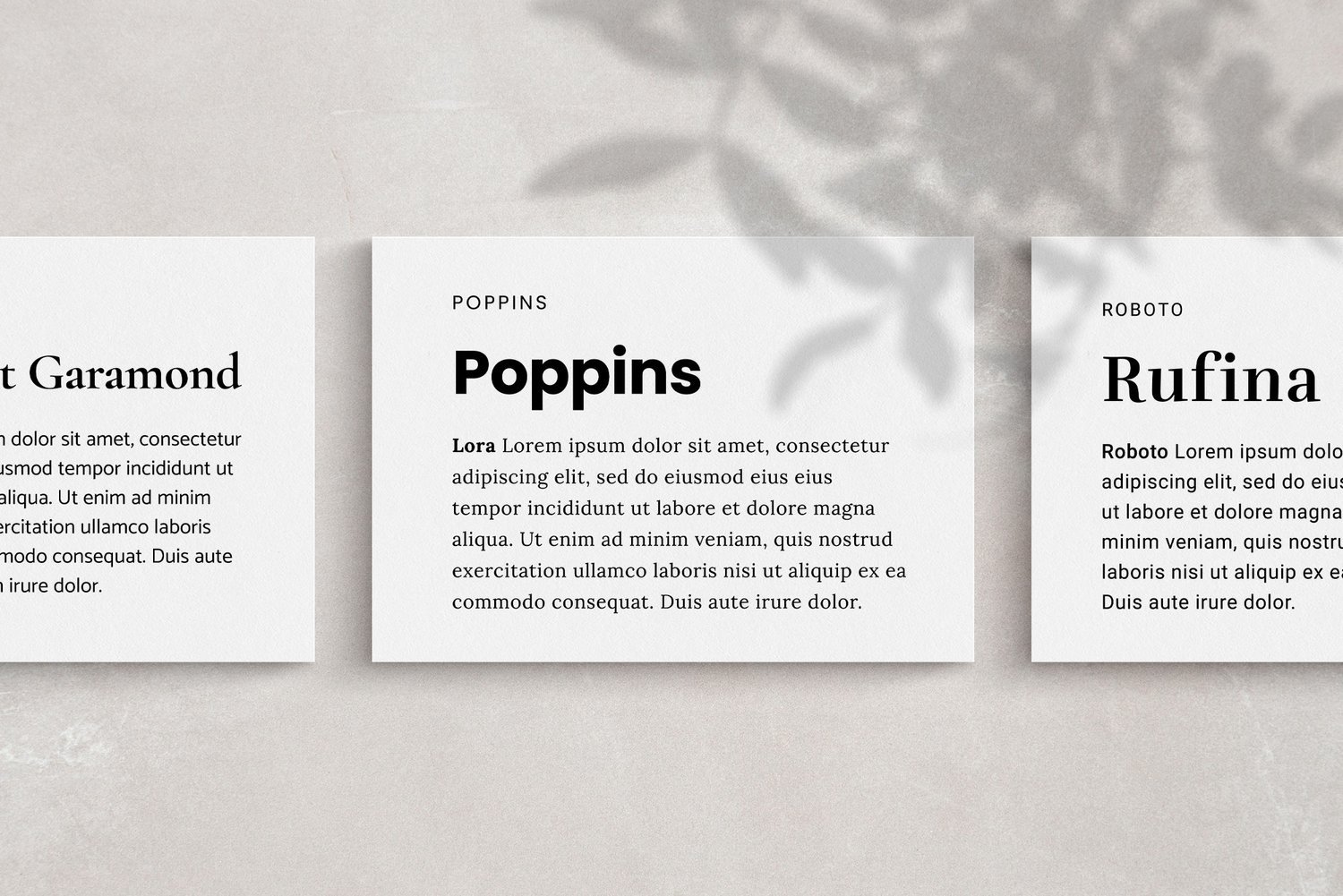
Roboto
Roboto is a modern, geometric sans-serif font. It features open curves and a friendly tone. This font is popular in web design. Roboto balances mechanical structure with natural shapes. It works well for blogs with a tech or lifestyle focus.
Montserrat
Montserrat draws inspiration from Buenos Aires street signs. It has a bold, urban look. This font stands out in headings and titles. Montserrat suits creative and trendy blog themes. Its clear letterforms improve readability on all devices.
Lato
Lato offers a sleek and corporate feel. It was created for brand identities. This font combines professionalism with warmth. Lato’s rounded edges add a friendly touch. It fits well with business and personal blogs alike.
Avenir
Avenir is a clean and modern typeface. It has geometric shapes with a human touch. This font is often used in branding and design. Avenir’s balanced style makes text inviting. It is ideal for blogs aiming for a polished look.
Serif Classics
Serif fonts bring a timeless charm to any blog. They add elegance and improve readability. These fonts suit blogs with a classic or formal tone. Serif Classics offer a rich history and great style for your content. They create a professional and trustworthy feel for your readers.
Garamond
Garamond is a well-known classic serif font. It has smooth curves and graceful letter shapes. This font is easy on the eyes and perfect for long articles. Garamond adds a warm and traditional touch to your blog. It works well for storytelling and educational content.
Bodoni
Bodoni stands out with its strong contrast between thick and thin lines. It looks stylish and modern yet keeps a classic feel. This font suits fashion, art, and luxury blogs. Bodoni grabs attention and gives headlines a bold look. It pairs well with simple sans-serif fonts.
Playfair Display
Playfair Display offers a decorative and elegant serif style. It features high contrast and distinctive letterforms. This font is ideal for titles and highlights. Playfair Display adds sophistication to your blog’s design. It enhances a refined and polished user experience.
Libre Baskerville
Libre Baskerville is a web-friendly serif font inspired by the traditional Baskerville. It has clear shapes and good readability on screens. This font suits formal blogs and professional topics. Libre Baskerville balances classic beauty with modern digital use. It provides a reliable and clean look.
Casual And Script Fonts
Casual and script fonts bring warmth and personality to blog designs. They create a friendly and inviting atmosphere. These fonts work well for personal blogs, lifestyle sites, and creative projects. Their flowing shapes and informal style add charm without sacrificing readability.
Using casual and script fonts can make your text feel more relatable. They often mimic handwriting or calligraphy, giving a personal touch. These fonts help your blog stand out and connect with readers on an emotional level.
Pacifico
Pacifico is a popular casual script font with a bold, playful look. It features smooth curves and rounded edges that mimic a relaxed handwriting style. This font suits blog titles, headers, and short phrases.
Its friendly design makes content feel welcoming and easygoing. Pacifico works best in larger sizes to maintain clarity. It pairs well with clean, simple fonts for body text to avoid visual clutter.
Credit: www.natsuminishizumi.com
Modern Sans-serif Picks
Modern sans-serif fonts offer a fresh and clean look for blogs. They provide excellent readability and work well on all screen sizes. These fonts help create a professional and approachable feel. Choosing the right modern sans-serif font can enhance your blog’s design and keep readers engaged.
Futura
Futura is a geometric sans-serif font known for its sharp and clear shapes. It has a timeless style that suits many blog themes. The font’s simplicity makes it easy to read on both desktop and mobile devices. Futura works well for headings and body text alike. Its clean lines give blogs a sleek, modern appearance.
Proxima Nova
Proxima Nova blends modern design with classic proportions. It is highly popular for web and print projects. The font’s smooth curves and balanced spacing improve readability. Proxima Nova adapts well to different text sizes, making it ideal for blogs. It adds a polished and friendly vibe to your content.
Font Pairing Tips
Choosing the right fonts for your blog helps create a clean, readable, and attractive design. Pairing fonts correctly improves the overall look and feel. This guide shares simple tips to pair fonts effectively.
Matching Styles
Fonts with similar styles work well together. Pair a serif font with another serif or a sans-serif with a sans-serif. This creates harmony and keeps the design consistent. Avoid mixing fonts that clash in style or mood.
Limiting Font Choices
Use no more than two or three fonts on your blog. Too many fonts cause confusion and clutter. Sticking to a few fonts makes your blog look neat and professional. Pick fonts that serve different purposes, like one for headings and one for body text.
Balancing Contrast
Contrast helps separate text and makes the content easy to read. Pair a bold font with a light one or a large font with a smaller size. This contrast draws attention to important parts. Make sure the fonts still look good together despite their differences.
Readability Factors
Readability is the key to keeping visitors on your blog. Clear text helps readers understand your message fast. Fonts affect how easy it is to read your content. Adjusting size, spacing, and letter shapes improves comfort and focus. These factors work together to make your blog user-friendly and inviting.
Font Size
Choosing the right font size matters a lot. Small text strains the eyes and drives readers away. Large text is easier to read but can look overwhelming. The ideal size for body text usually ranges from 16px to 18px. Headlines need to be bigger to grab attention. Keeping size consistent helps maintain a clean layout.
Line Spacing
Line spacing is the vertical gap between lines of text. Too tight spacing makes the content feel cramped and hard to follow. Too much space breaks the flow and slows reading. A good line height is about 1.5 times the font size. This balance allows the eyes to move smoothly down the page.
Letter Spacing
Letter spacing is the space between individual characters. Tight letter spacing can blur letters together. Wide letter spacing can make words look disconnected. Adjusting letter spacing improves clarity and style. For body text, normal or slightly increased spacing works best. Headlines can use varied spacing to add emphasis.
Fonts For Different Blog Types
Choosing the right font can boost your blog’s appeal and readability. Different blog types need fonts that match their tone and style. The font sets the mood and helps readers connect with your content. Below are font suggestions for popular blog categories.
Lifestyle Blogs
Lifestyle blogs should feel warm and welcoming. Use friendly, easy-to-read fonts. Sans-serif fonts like Montserrat and Lato work well. They offer a clean look that fits casual topics. Script fonts like Pacifico add a personal touch for headers or accents. Avoid overly formal fonts to keep the tone relaxed and inviting.
Professional Blogs
Professional blogs need fonts that look polished and clear. Serif fonts such as Garamond and Libre Baskerville add an elegant, trustworthy feel. Sans-serif fonts like Roboto and Avenir provide a modern, business-like look. Keep font choices simple and consistent. This helps readers focus on the content without distractions.
Creative Blogs
Creative blogs benefit from unique and artistic fonts. Use bold, expressive fonts like Bodoni for headlines. Combine them with neutral fonts like Proxima Nova for body text. This balance keeps the blog readable but stylish. Experiment with font pairings to reflect your creativity. Just make sure the text remains easy to read.
Credit: www.blogtyrant.com
Web Safe Fonts
Web safe fonts are a group of typefaces that display correctly across most web browsers and devices. They ensure your blog’s text looks consistent for all readers. Using web safe fonts reduces the chance of fonts not showing up or being replaced by default fonts.
These fonts come pre-installed on most operating systems like Windows, macOS, and Linux. This availability makes them reliable choices for blog content. They help maintain readability and a clean design without loading delays.
Choosing Reliable Options
Pick fonts that are widely supported and easy to read. Common web safe fonts include Arial, Times New Roman, and Courier New. These fonts have been tested over time and work well in many contexts.
Sans-serif fonts like Arial and Verdana offer a modern look and good legibility. Serif fonts such as Georgia and Times New Roman provide a classic, formal feel. Match the font style with your blog’s theme to create a pleasant reading experience.
Fallback Fonts
Fallback fonts act as backups if the primary font fails to load. Specify a list of fonts in your CSS to ensure text always appears properly. For example, if you choose Helvetica, follow it with Arial and then a generic sans-serif.
This technique prevents ugly font substitutions and layout breaks. It also improves page loading times by avoiding font downloads. Always include a generic font family at the end of your font stack.
Custom Fonts And Licensing
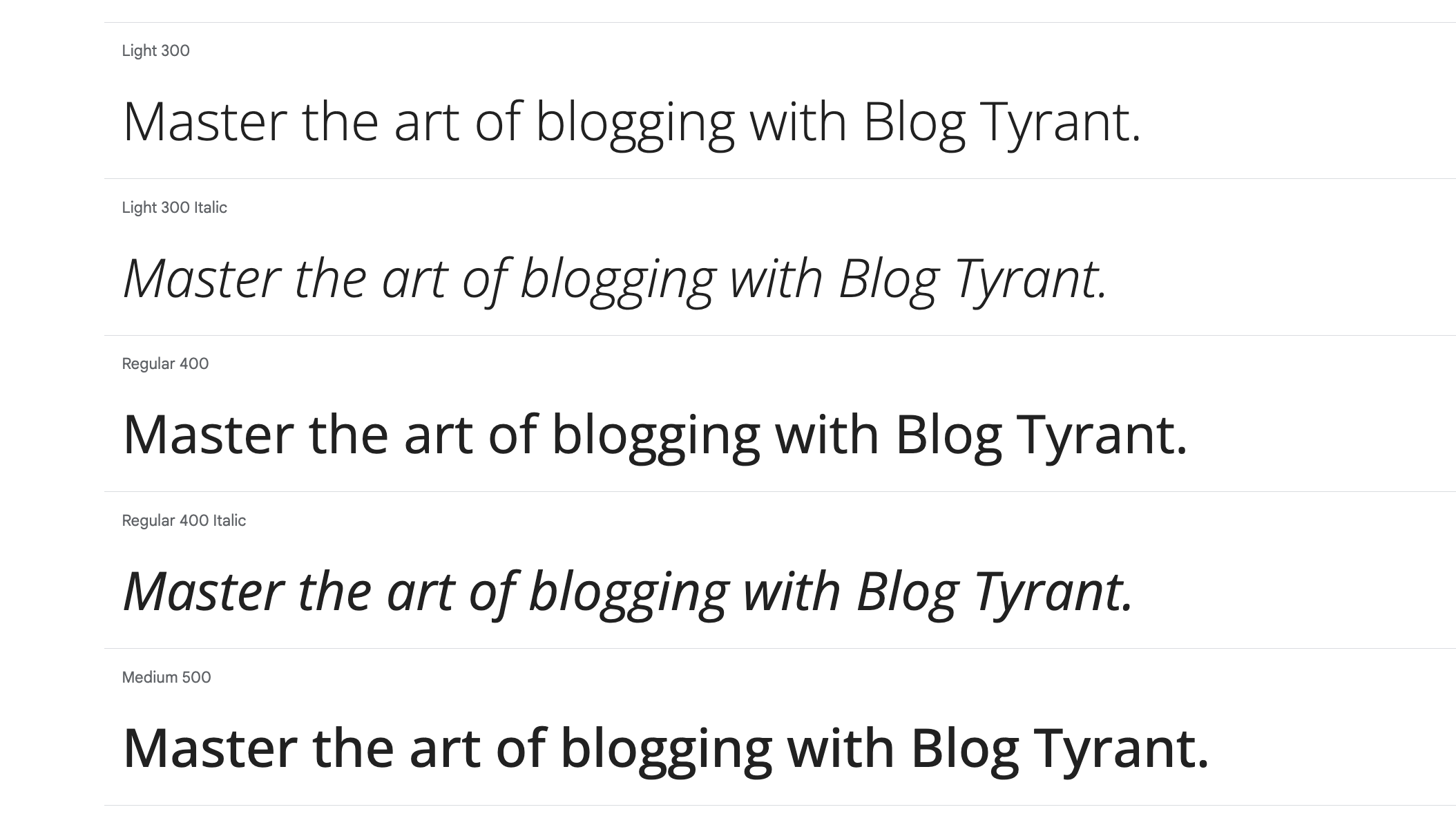
Custom fonts give your blog a unique and personal touch. They help set your blog apart from others. Using the right fonts can improve readability and keep visitors engaged. But choosing custom fonts involves understanding licensing rules. Licensing determines how you can use a font legally. Some fonts are free, while others require payment. Knowing these differences protects your blog from legal issues.
Free Vs Paid Fonts
Free fonts are easy to find and use. Many sites offer high-quality fonts at no cost. They often come with simple licenses allowing personal and commercial use. Paid fonts usually offer more style choices and better support. These fonts often have clear licenses for multiple uses. Buying a font supports the creator and ensures you get updates. Using paid fonts can give your blog a professional edge.
Embedding Fonts On Websites
Embedding fonts means adding them directly to your website. This keeps your blog’s style consistent on all devices. Web fonts can be added via services like Google Fonts or by hosting files yourself. Proper embedding respects font licenses and avoids slow loading times. It also ensures fonts display correctly on different browsers. Always check the license to confirm embedding is allowed. Embedding custom fonts enhances your blog’s look and feel.
Tools To Explore Fonts
Choosing the right font is essential for a blog’s readability and style. Various tools help explore and test fonts before adding them to your blog. These tools offer a wide range of fonts and easy ways to compare styles. Experimenting with fonts can improve your blog’s look and make content more engaging.
Google Fonts
Google Fonts offers hundreds of free fonts for web use. You can preview fonts with your own text and see how they look in different sizes. The platform allows easy downloading and embedding of fonts into your blog. It supports many languages and styles, making it versatile for any blog theme.
Figma
Figma is a design tool that helps you explore fonts within your blog layout. You can test multiple fonts side by side and adjust their size and spacing. It allows collaboration, so you can get feedback from others. Figma also supports importing custom fonts for more options.
Canva
Canva is a user-friendly graphic design tool with many font choices. You can create blog headers and images using different fonts to see what fits best. Canva’s drag-and-drop interface makes font testing simple for beginners. It also offers font pairing suggestions to help you combine fonts easily.
Frequently Asked Questions
What Is The 3 Font Rule?
The 3 font rule advises using no more than three fonts in a design. Choose fonts that complement or share similar qualities for a cohesive look.
What Font Is Most Attractive?
The most attractive fonts vary by use. Popular choices include Helvetica, Roboto, Montserrat for modern looks, and Garamond, Bodoni, Playfair Display for elegance. These fonts blend style with readability, making designs visually appealing and professional.
Which Font Is Seo Friendly?
SEO-friendly fonts are clean, readable, and web-safe. Popular choices include Roboto, Open Sans, Lato, and Montserrat for clear display on all devices. These fonts improve user experience and load quickly, boosting search rankings effectively.
What Is The Most Attention Grabbing Font?
The most attention-grabbing fonts are bold, clear, and modern. Popular choices include Impact, Helvetica, and Futura. These fonts stand out with strong, clean lines, making text easy to read and visually striking. Use them to capture viewers’ focus quickly and effectively.
What Are The Best Fonts For Blog Readability?
Sans-serif fonts like Roboto, Helvetica, and Montserrat improve blog readability on screens.
How Many Fonts Should I Use In A Blog Design?
Limit fonts to two or three to keep a clean, cohesive look on your blog.
Which Fonts Suit A Professional Blog Style?
Fonts like Lato, Avenir, and Proxima Nova create a modern, professional appearance.
What Fonts Work Well For A Classic Blog Look?
Serif fonts such as Garamond, Bodoni, and Playfair Display add elegance to blogs.
Are Script Fonts Good For Blog Headers?
Script fonts like Pacifico work well for friendly headers but should be used sparingly.
How To Choose Fonts That Complement Each Other?
Pick fonts with similar styles or moods to ensure they match and look balanced.
Conclusion
Choosing the right fonts can boost your blog’s readability and style. Stick to two or three fonts that work well together. Sans-serif fonts like Helvetica and Roboto offer a modern, clean look. Serif fonts such as Garamond and Playfair Display add elegance and tradition.
Remember, fonts should match your blog’s tone and audience. Simple, clear fonts help readers enjoy your content more. Test different fonts to find what feels right for your blog. Good font choices make your posts easier to read and more inviting.