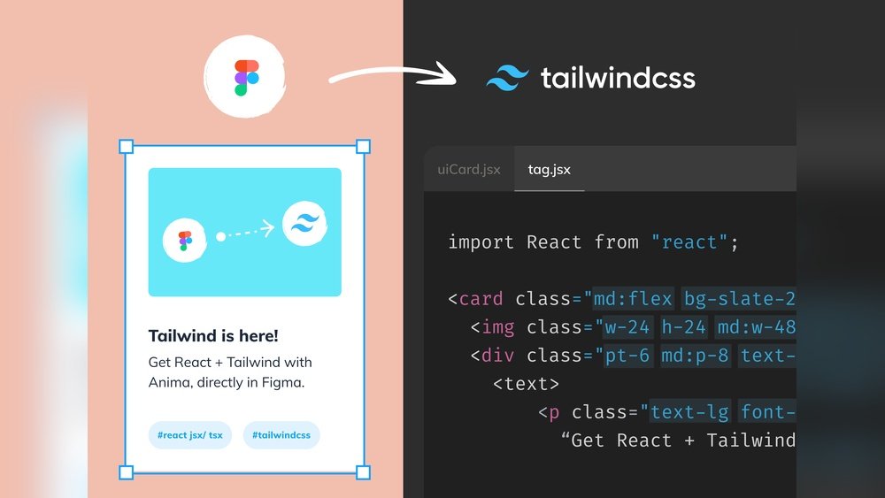
Imagine having a secret force that pushes your projects forward effortlessly, helping you build stunning websites faster and more efficiently. That’s exactly what Tailwind offers you.
Whether you’re a beginner or an experienced developer, Tailwind’s utility-first CSS framework changes the way you design, making your work smoother and your results sharper. If you want to save time, create responsive designs with ease, and stay ahead in the web development game, this article is made just for you.
Keep reading to discover how Tailwind can become your ultimate ally in crafting modern, beautiful websites.

Credit: en.wikipedia.org
Tailwind Css Basics
Tailwind CSS offers a fresh way to style websites. It uses utility classes to build designs fast. Instead of writing custom CSS, you apply pre-made classes directly in HTML. This approach helps create clean and consistent layouts easily.
Understanding the basics of Tailwind CSS is key. It allows you to use simple class names for colors, spacing, fonts, and more. These classes follow a clear pattern, making it easy to learn and remember.
What Is Tailwind Css?
Tailwind CSS is a utility-first framework. It provides many small classes that control one style property each. For example, text-center centers text, and bg-blue-500 sets a blue background. This method keeps your HTML clear and avoids writing custom styles.
How To Use Utility Classes
Utility classes are the building blocks in Tailwind. Each class sets a specific style. Combine them to create complex designs. For example, p-4 adds padding, m-2 adds margin, and text-lg sets large text. These classes work together inside your HTML elements.
Responsive Design With Tailwind
Tailwind makes responsive design simple. Use prefixes like sm:, md:, and lg: before a class to target screen sizes. For example, md:text-xl makes text larger on medium screens. This helps build websites that look good on all devices.
Customizing Tailwind
Tailwind is highly customizable. You can change colors, fonts, and spacing in the config file. This file controls the default design system. Customization helps match your project’s style without losing consistency.
How Tailwind Speeds Up Development
Tailwind CSS helps developers build websites faster and easier. It uses utility classes that apply styles directly in HTML. This approach reduces the need to write custom CSS files.
Developers spend less time switching between HTML and CSS. Tailwind’s ready-made classes speed up the design process. It makes styling quicker and more consistent across projects.
Using Utility-first Classes
Tailwind offers a wide range of small, reusable classes. Each class controls a single style property. Developers combine these classes to create complex designs quickly.
This method avoids writing new CSS rules for each component. It saves hours of coding and testing. The result is cleaner, easier-to-read HTML code.
Faster Prototyping And Layouts
Tailwind allows rapid creation of page layouts. Developers can adjust margins, padding, colors, and fonts instantly. This speeds up the prototyping phase without waiting for CSS compilation.
Changes happen in real time, making design tweaks simple. It helps teams test ideas faster and improve user experience quickly.
Built-in Responsive Design
Tailwind includes responsive utilities out of the box. Developers add breakpoints using simple class prefixes. This approach eliminates writing separate media queries.
Responsive design becomes easier and less error-prone. It ensures websites look good on all devices without extra effort.
Reusable Components And Consistent Styles
Tailwind promotes reusable components styled with utility classes. Teams can maintain a consistent look across pages easily. This reduces bugs from conflicting CSS styles.
Developers save time by reusing components instead of creating new styles each time. The design stays uniform and professional.
Optimizing File Size
Optimizing file size is crucial when using Tailwind CSS. Smaller files load faster and improve user experience. Tailwind’s utility-first approach can sometimes create large CSS files. This happens when all utility classes are included without filtering. Reducing the file size helps sites run smoother and saves bandwidth.
Using Purgecss To Remove Unused Styles
PurgeCSS scans your files to find which CSS classes you use. It removes all unused classes from the final CSS file. Tailwind integrates well with PurgeCSS for easy setup. This step drastically cuts down your CSS file size. Only the styles needed for your site remain.
Enabling Just-in-time (jit) Mode
JIT mode generates CSS on demand while you build. It creates only the styles that you actually use in your code. This makes your CSS file much smaller. JIT mode also speeds up development by updating styles instantly. It is now the recommended way to use Tailwind.
Limiting The Color Palette And Fonts
Keeping your color palette small reduces CSS bloat. Tailwind allows custom configuration to pick only needed colors. The same goes for fonts and other design tokens. Avoid loading many font families or weights. This practice keeps your CSS clean and light.
Minifying The Css Output
Minification removes spaces and comments from your CSS files. It reduces the file size further without changing functionality. Tools like PostCSS and cssnano work well with Tailwind. Minified CSS loads faster and improves website performance.
Using Purgecss With Tailwind
Using PurgeCSS with Tailwind is key to keeping your project fast and small. Tailwind generates many CSS classes. Most are not used in your project. This can make your CSS file very large. PurgeCSS helps remove unused styles. This reduces the final CSS size. Smaller CSS files load faster in browsers. This improves website performance and user experience.
PurgeCSS scans your HTML, JavaScript, and other files. It finds which Tailwind classes you actually use. Then it removes all unused classes from your CSS. This process is simple to add to your build setup. Many developers use PurgeCSS with Tailwind in production builds. It makes websites lean without losing style options.
How To Configure Purgecss In Tailwind
To start, open your tailwind.config.js file. Add a purge section to it. List the paths to your HTML and JS files. This tells PurgeCSS where to look for classes. For example:
module.exports = { purge: ['./src//.html', './src//.js'], // other config options }This setup lets PurgeCSS scan your files. It keeps only the classes you use. Your CSS file will shrink significantly.
Integrating Purgecss With Build Tools
PurgeCSS works well with tools like PostCSS and Webpack. Tailwind uses PostCSS by default. Add PurgeCSS as a plugin in your PostCSS config. This removes unused CSS during build time. You can also use it with other bundlers. This automation saves time and avoids errors. The build process outputs a clean, optimized CSS file.
Benefits Of Using Purgecss With Tailwind
The main benefit is smaller file sizes. Smaller CSS means faster page loads. Faster pages improve user satisfaction and SEO. PurgeCSS also helps keep your codebase clean. It removes clutter and unused styles. This makes maintenance easier. Your project stays organized and efficient over time.
Customizing Tailwind Configurations
Customizing Tailwind configurations allows you to tailor the framework to fit your project’s needs. It offers flexibility beyond the default settings. You can change colors, fonts, spacing, and more. This makes your design unique and consistent.
By editing the tailwind.config.js file, you control the look and feel of your site. This simple file holds all your custom settings. It helps you keep your styles organized and reusable.
Extending the Default ThemeExtending the default theme means adding new values without removing existing ones. You keep all the built-in styles and add your own. For example, you can add custom colors or new font sizes. This approach keeps your design flexible and easy to update.
Adding Custom ColorsCustom colors help your brand stand out. You add them inside the theme’s colors section. Use simple names to remember them easily. Then, use these colors in your classes like bg-customColor or text-customColor. It improves your site’s visual appeal.
Configuring Responsive BreakpointsResponsive breakpoints control how your layout changes on different screens. Tailwind has default breakpoints for mobiles, tablets, and desktops. You can add or modify these breakpoints in the config file. This ensures your design looks good on all devices.
Leveraging Utility-first Approach
Tailwind CSS uses a utility-first approach that changes how developers build websites. Instead of writing custom CSS, developers apply small, reusable classes directly in HTML. This approach speeds up development and keeps the design consistent.
With utility classes, each class controls a single style property like margin, padding, or color. Developers combine these classes to create complex designs without leaving the HTML file. This method reduces the need for long CSS files and makes changes easier.
What Is Utility-first Css?
Utility-first CSS focuses on small, single-purpose classes. Each class applies one style, such as text-center or bg-blue-500. This lets developers build layouts by mixing and matching classes.
This approach avoids writing custom CSS for every element. Instead, reuse ready-made classes to save time and keep code clean.
Benefits Of Using Utility-first Classes
Utility-first classes help create consistent designs faster. Developers see all styles in the HTML, making it easy to understand and update. This reduces bugs and improves collaboration across teams.
It also helps maintain responsive design. Tailwind offers built-in breakpoints, so developers add classes for different screen sizes easily.
How Utility-first Boosts Productivity
Using utility classes means less context switching between HTML and CSS files. Developers focus on one file, which speeds up coding. They can prototype quickly and adjust styles without waiting for CSS compilation.
This approach also reduces code duplication. Developers write fewer lines and avoid overriding styles, leading to cleaner projects.
Implementing Responsive Design
Responsive design is key to making websites work well on all devices. Tailwind CSS offers simple tools to create flexible layouts. It helps designs adjust smoothly to different screen sizes.
Using Tailwind, developers apply utility classes that change styles based on device width. This approach saves time and keeps code clean. Let’s explore how to build responsive designs with Tailwind.
Responsive Utility Classes In Tailwind
Tailwind uses prefixes to target screen sizes. For example, sm:, md:, lg:, and xl: set styles for small to extra-large screens. These prefixes modify the base class only at or above the breakpoint.
To make text larger on tablets, use md:text-lg. For hiding elements on phones but showing on desktops, use hidden md:block. This method creates adaptive designs quickly.
Setting Breakpoints For Flexible Layouts
Breakpoints define screen widths where styles change. Tailwind’s defaults cover common device sizes. Developers can customize these in the config file for unique needs.
Using breakpoints, grids and flex containers adjust their layout. Columns stack on small screens and align horizontally on larger ones. This ensures content fits well everywhere.
Handling Images And Media Responsively
Images must scale correctly on all devices. Tailwind provides classes like max-w-full and h-auto to keep images within their containers.
Responsive images improve load times and user experience. Tailwind also supports object-fit classes to control image cropping across screen sizes.

Credit: stockx.com
Improving Load Times With Lazy Loading
Improving load times is essential for better website performance. Lazy loading helps by delaying image and content loading until needed. This technique reduces initial page load time and saves bandwidth. Visitors see content faster, which improves user experience and SEO rankings.
What Is Lazy Loading?
Lazy loading means loading images and videos only when visible. It avoids loading all media at once. This reduces the amount of data transferred initially. Pages appear faster because less content loads at the start.
How Tailwind Supports Lazy Loading
Tailwind CSS works well with lazy loading techniques. It offers utility classes to style elements efficiently. You can combine Tailwind with JavaScript or plugins for lazy loading. This makes integrating lazy loading simpler and faster.
Benefits Of Lazy Loading For Websites
Lazy loading improves page speed and reduces server load. It saves user data on slow connections. Faster pages keep visitors engaged longer. Search engines rank faster websites higher in results.
Implementing Lazy Loading With Tailwind
Use the loading="lazy" attribute on images and iframes. Tailwind classes control layout and spacing while lazy loading happens. Pair Tailwind with libraries like Lozad.js or LazySizes for advanced control.
Integrating Tailwind With Build Tools
Integrating Tailwind with build tools improves your development workflow. It allows automatic CSS generation and optimization. This process saves time and reduces manual work. Tailwind works well with popular tools like Webpack, Vite, and PostCSS.
Using build tools, you can customize Tailwind’s configuration. This ensures your styles match your project needs. Build tools also help purge unused CSS. This keeps your final CSS file small and fast.
Installing Tailwind With Npm And Build Tools
Start by installing Tailwind via npm. Run npm install tailwindcss in your project folder. Then, create a Tailwind config file using npx tailwindcss init. This file lets you customize colors, fonts, and more.
Next, set up your build tool to process Tailwind. For example, configure PostCSS to use Tailwind as a plugin. This step converts Tailwind directives into real CSS.
Configuring Tailwind With Webpack
Webpack is a popular bundler for JavaScript and CSS. To use Tailwind, add it to your PostCSS setup inside Webpack config. This allows Tailwind to generate styles during the build process.
Include Tailwind’s CSS file in your main stylesheet. Webpack then bundles it with your other assets. This method keeps your code organized and efficient.
Using Tailwind With Vite For Faster Builds
Vite is a modern build tool with fast hot module replacement. It supports Tailwind through PostCSS plugins. Add Tailwind to your Vite config file under CSS plugins.
This setup provides instant CSS updates while you code. It speeds up development and testing. Vite’s simplicity makes it easy for beginners to use Tailwind.
Optimizing Tailwind With Purgecss
PurgeCSS removes unused CSS to reduce file size. Tailwind integrates with PurgeCSS in the build process. Configure purge paths in your Tailwind config file to target your HTML and JS files.
This step keeps only the CSS you use. Smaller CSS files mean faster website loading times and better user experience.

Credit: www.sneakerfiles.com
Common Mistakes To Avoid
Using Tailwind CSS can speed up web design. Still, some common mistakes slow progress and cause frustration.
Avoiding these errors helps create clean, efficient, and responsive sites.
Incorrect Use Of Utility Classes
Many users apply too many utility classes in one element. This makes code hard to read and maintain.
Focus on using the most important classes and group related styles logically.
Ignoring Responsive Design Features
Tailwind offers great tools for responsive design. Skipping these results in poor mobile experiences.
Always test your site on different screen sizes and use Tailwind’s responsive prefixes.
Overriding Tailwind Defaults Without Need
Changing default configurations too often can cause confusion and bugs.
Stick to Tailwind’s defaults unless you have a strong reason to customize.
Not Using Purgecss To Remove Unused Styles
Failing to enable PurgeCSS leads to large CSS files that slow down websites.
Set up PurgeCSS to keep your CSS bundle small and fast loading.
Forgetting Accessibility And Semantic Html
Tailwind focuses on styling, but accessibility matters too.
Use proper HTML tags and ARIA attributes alongside Tailwind classes for better user experience.
Frequently Asked Questions
What Is The Definition Of A Tailwind?
A tailwind is a wind blowing in the same direction as an aircraft or vehicle, aiding faster movement and fuel efficiency.
What Do Tailwinds Mean In Business?
Tailwinds in business are favorable conditions that boost growth, performance, and profitability. They include strong economy, innovation, market trends, and supportive policies. Tailwinds help companies advance faster, similar to how wind aids an aircraft’s movement.
What Is Tailwind Used For?
Tailwind is a utility-first CSS framework used to rapidly build custom, responsive user interfaces with minimal CSS writing.
What Is Tailwind For Runners?
Tailwind for runners refers to wind pushing runners forward, making running easier and faster by reducing effort and resistance.
What Is Tailwind In Web Development?
Tailwind is a utility-first CSS framework to style websites quickly and easily.
How Does Tailwind Css Differ From Other Frameworks?
Tailwind uses small utility classes instead of pre-built components, offering more design control.
Can Beginners Learn Tailwind Css Easily?
Yes, Tailwind’s simple class names make it easy for beginners to start styling fast.
What Are The Benefits Of Using Tailwind Css?
It speeds up development, keeps CSS small, and improves consistency in design.
Is Tailwind Css Good For Responsive Design?
Tailwind has built-in responsive utilities to create mobile-friendly websites effortlessly.
How Does Tailwind Improve Website Performance?
Tailwind removes unused styles with PurgeCSS, making websites load faster.
Conclusion
Tailwind offers a simple way to design websites quickly and clearly. Its utility-first approach helps you build responsive layouts with ease. Using Tailwind saves time by reducing CSS writing and repetition. Many developers enjoy its flexibility and consistent results. Learning Tailwind can improve your web projects and workflow.
Try it out to see how it fits your needs. Tailwind keeps your code clean and your design sharp. A practical tool for both beginners and pros alike.